Layered Presentation of Graphics with +aes() in ggplot2
Here is the post is about how to implement a layered presentation of a graphics. Matthew Blackwell tweeted about the concept earlier this year, which seemed to reasonated with a lot of folks - to the tune of > 1500 likes! Practical, pedegogical stuff tends to get people excited. True for me too.
My best tip on how to give better quantitative presentations is to (a) use more plots and (b) build up your plots on multiple overlays, as in:
— Matt Blackwell (@matt_blackwell) April 30, 2018
- Just x-axis (explain it)
- Add y-axis (explain it)
- Add 1 data point (explain it)
- Plot the rest of the data (explain it)
Anyway, this to me sounded a lot like the ggplot “layered grammar of graphics” ideology, and I retweeted this thought which resonated with a lot fewer people!
Good ideas! Very #ggplot. A layered presentation of graphics. https://t.co/M4tRB9bGS5
— Gina Reynolds (@EvaMaeRey) May 1, 2018
So then I set out to write an implementation with ggplot. I actually wrote a couple of implementations and what follows is my favorite, which is demonstrated using a year of data from the gapminder data package.
library(tidyverse)
library(gapminder)
data = gapminder %>% filter(continent == "Americas" & year == 2002)
Okay, the data is ready and packages loaded. Now for plotting:
Step 1: Just x-axis (explain it)
ggplot(data) +              # declare the data you want to use
  aes(x = gdpPercap) +      # declare the aesthetic mapping for x
  theme_bw(base_size = 20)  # we want label sizes to be a bit bigger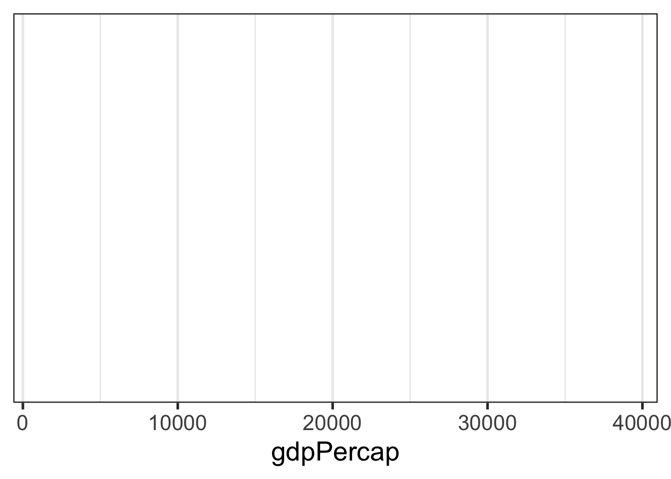
Step 2: Just y-axis (explain it)
last_plot() +      # we just add to the last plot
  aes(y = lifeExp) # add the aesthetic mapping for y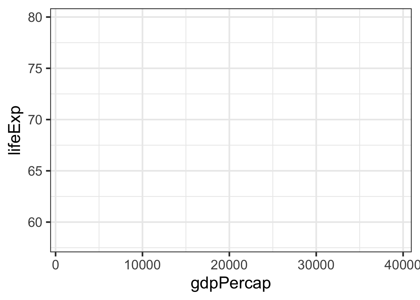
Step 3: Add 1 data point (explain it)
last_plot() +
  geom_point() +  # declare the geom to add
  aes(alpha = country == "Chile") +  # alpha is transparency aesthetic
scale_alpha_discrete(guide = FALSE, range = c(0,1)) 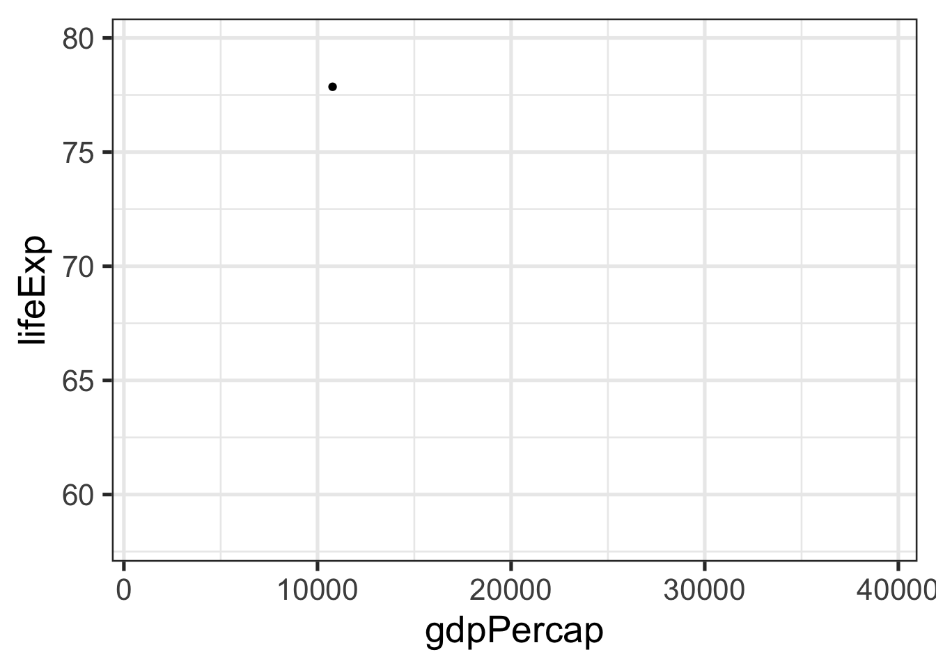
Above, we use an extreme range, so Chile is fully opaque and the rest of the points are fully transparent. So the point for Chile is the only point that will appear.
Step 4: Plot the rest of the data (explain it)
Now we overwrite the alpha levels so that all are observations (countries) are represented with a fully opaque point.
last_plot() +
scale_alpha_discrete(guide = FALSE, range = c(1,1)) 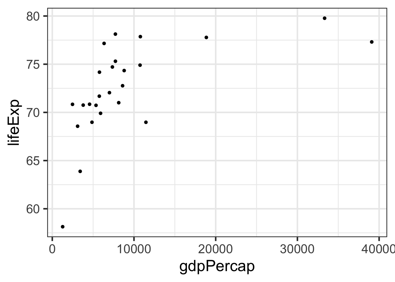
Done!
So, a (big) bonus of this exercise was discovering that you can use aes() to set global aesthetics outside of the ggplot() function. This is not the usual way that ggplot is taught (see the RStudio Cheatsheats for example) but I really like it, because using it gives you even more of that “building-up-the-plot”, step-by-step, layered feel that makes ggplot so attractive!