Layered Presentation of Graphics, revised
Here is my second post is about how to implement a layered presentation of a graphics. My previous implementation used the alpha transparency aesthetic to hide all but one point. But, now, rethink things, now for the 3rd time or so, I just subset the data associated with the first geom layer, leaving the global data complete.
I think it is more straight forward than messing around with alpha. Several folks brought up geom_blank() having looked at the previous implementation, but I didn’t find it necessary in this case if you are using last_plot() which I think it makes sense to do in this context. Still, geom_blank is good to know about.
This time around, I’ll do a little with labeling too. Before, I left labels as variable names, which wouldn’t really be acceptable in a presentation setting, at least with the present example.
Here again is the original inspiration:
My best tip on how to give better quantitative presentations is to (a) use more plots and (b) build up your plots on multiple overlays, as in:
— Matt Blackwell (@matt_blackwell) April 30, 2018
- Just x-axis (explain it)
- Add y-axis (explain it)
- Add 1 data point (explain it)
- Plot the rest of the data (explain it)
And the goal is simply to write an implementation, with some data:
library(tidyverse)
library(gapminder)
my_data = gapminder %>% filter(continent == "Americas" & year == 2002)
Okay, the data is ready and packages loaded. Now for plotting:
Step 1: Just x-axis (explain it)
ggplot(my_data) +            # declare the data you want to use
  aes(x = gdpPercap) +       # declare the aesthetic mapping for x
  theme_bw(base_size = 20) + # we want label sizes to be a bit bigger
labs(x = "Per capita GDP\n(US$, inflation-adjusted)") 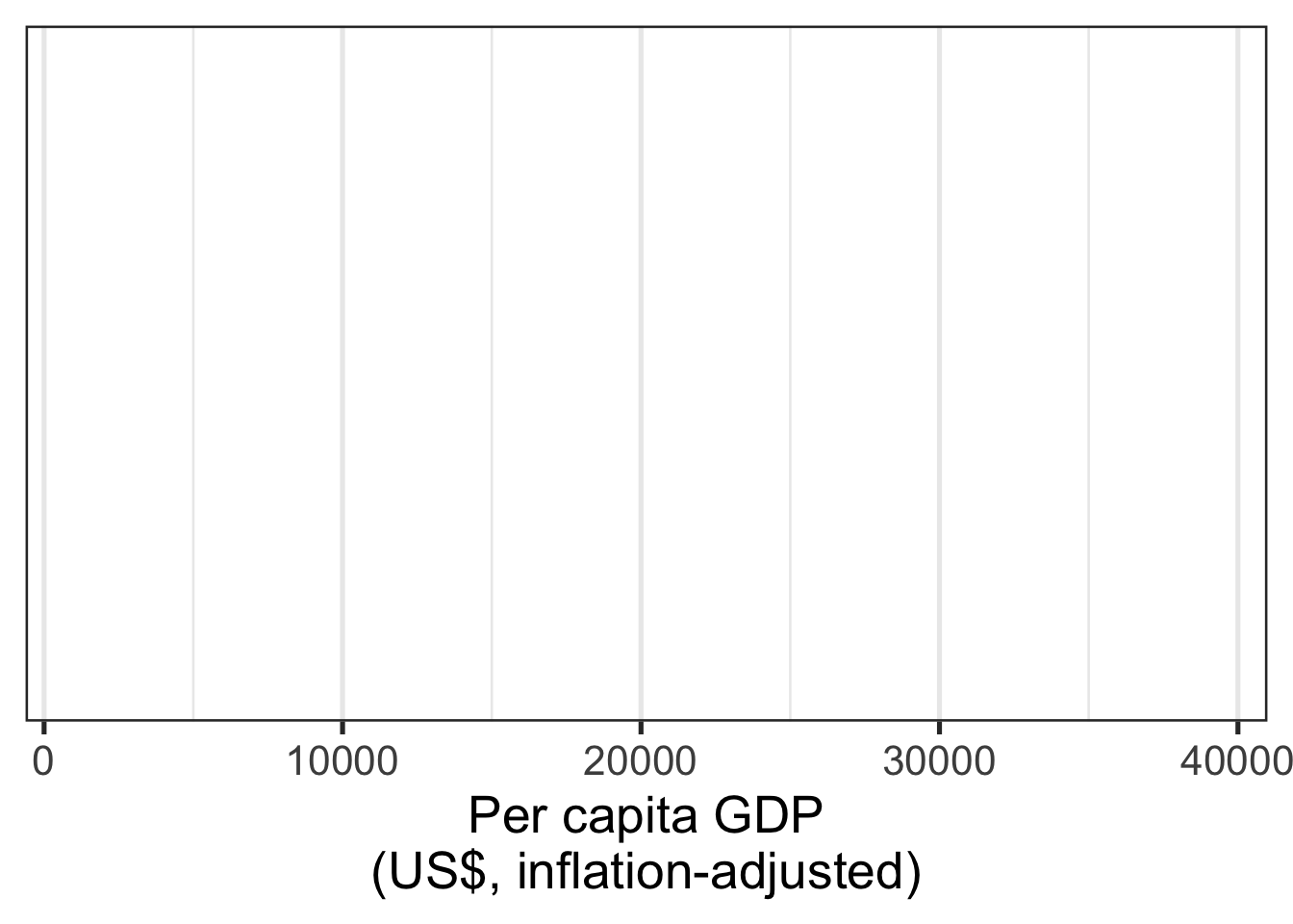
# instead of variable name, we give x axis a nice nameStep 2: Just y-axis (explain it)
last_plot() +        # we just add to the last plot
  aes(y = lifeExp) + # add the aesthetic mapping for y
  labs(y = "Life Expectancy\n(years)") # a nice axis label
Step 3: Add 1 data point (explain it)
last_plot() +
geom_point(data = my_data %>% filter(country == "Chile")) # declare the geom to add 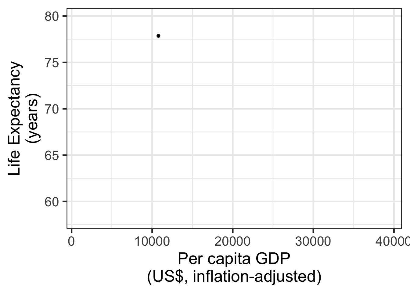
I use geom_point() to add the layer where Chile’s data is shown. I indicate that I want points to be added for onlly a subset of the data by specifying that with the data argument.
Step 4: Plot the rest of the data (explain it)
Add another geom_point() layer. This time, the data that will be used is the global data, as there is no data specified in the function.
last_plot() +
geom_point()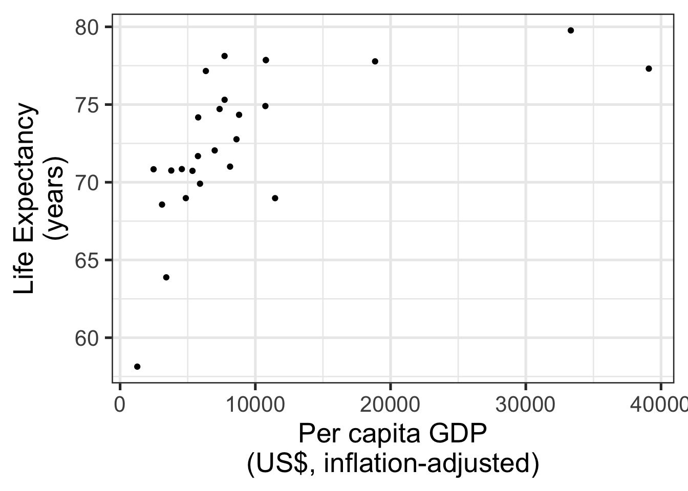 Done!
Done!
Why didn’t I come up with this before? I think it didn’t have the presence of mind because my mind had just been blown by the possibility of adding global aesthetics outside of the ggplot() statement. I was very excited about that discovery! Also, ggplot2 has also had an update since the original implmentation. Perhaps the behavior was different in a previous version. Don’t know. Not gonna check at this point. I guess probably it wasn’t.