Federalist Papers
Every couple of weeks I like to explore data that’s brand new to me. I anticipate a one-hour, one-off project. Usually this turns out to be a beautiful lie, and the projects chew up much more time. Still, this enticing time-line is pulling me into new projects from time to time.
Earlier this week, I heard about the dispute of authorship of some of the Federalist papers.
"Hamilton wrote the other 51!", go the unqualified song lyrics. But did he? 😮 Federalist papers authorship inquiries sound like a great way to introduce #textasdata ideas, especially to Hamilton the Musical fans. Musings upon read of @arthur_spirling and @ptrckprry's "boring".👍 https://t.co/nm4AoVeOTU
— Gina Reynolds (@EvaMaeRey) June 13, 2018
I mentally flagged the topic for one a one-hour, one-off. A who-done-it of text analysis, that conjures up the songs of the biggest Broadway hit since … take your pick. What’s not to like?
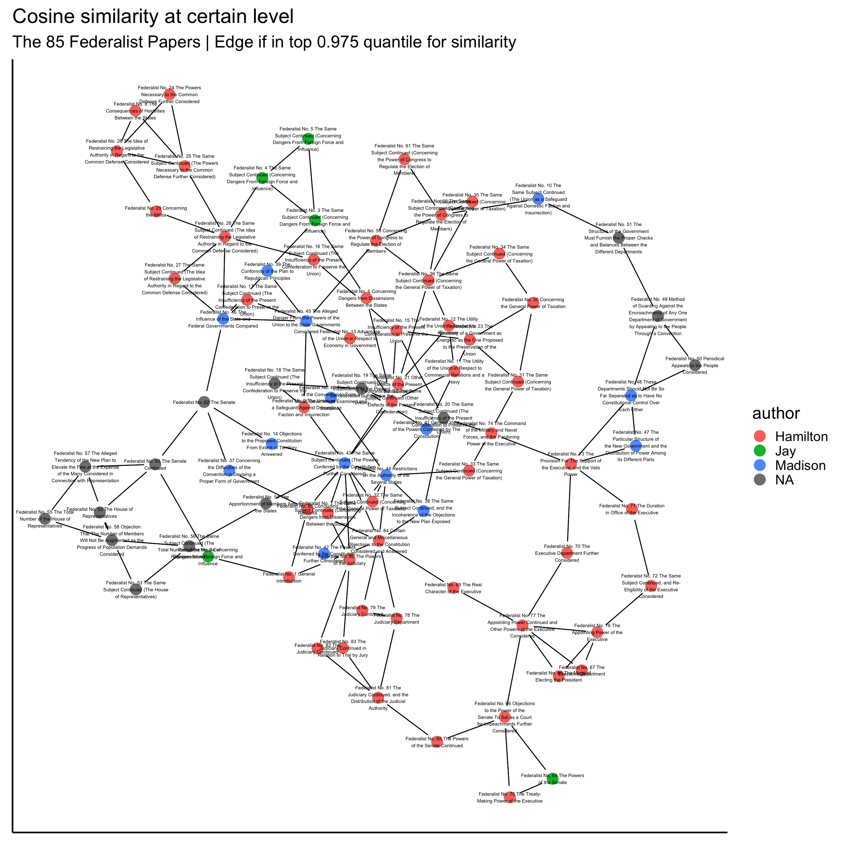
Also, I’ve been working on a visualization procedure for small corpora like this one; this would be another chance to try it out. The procedure visualizes documents as nodes in a network, and connects the documents with edges only if for the pair, their similarity scores are in the top percentiles for one or the other of the pair members.
I don’t see other researchers doing this which makes me worry that: 1) there are principled reasons not to do this or 2) I’m not googling hard enough. Regarding the former, in creating such a graph, there is some arbitrary decision-work to be done: what is the similarity score to be used; what threshold of should be used for drawing connections; and which network layout should be draw? A critic might think that, given these decisions, this type of visual summary of a corpus in the best case is impressionistic, and in the worst case invites misinterpretation. The later can be managed, I think, if there is enough time/space to talk/write about the decisions made in creating the graph.
Putting aside these concerns, I can put together this visualization contentedly.
The deciding factor for moving ahead with this quick project was that the Federalist Papers were ready-to-use in corpus in the R package “corpus”, by Patrick O. Perry. Sold! Install and load package.
library(corpus) I was also “sold” by the size of the corpus. The Federalist Paper, with its 85 documents lends to my small-corpus network graph visualization. Network graphs tend to get messy and overwhelming looking with more than 100 nodes. Developing this visualization technique, I’ve used a few corpora that have well beyond 100 documents, like UN Security Council Resolutions (in an ongoing project with @felixhass and @F_Bethke, > 2000 documents); Research & Politics Articles (solo, ~ 200 documents); and National Anthems (in ongoing work with @marinkobobic and @Jarek_Kantor, ~ 200 documents), and the options with these way-too-large and too-large corpora is to subsample and plot, or to just leave things messy. But the trim Federalist Papers doesn’t present this problem!
The question
My question was whether this visualization method could provide insight into who wrote the disputed essays. Apparently Hamilton claimed quite a few more essays, that later Madison claimed that he wrote. Lin Manuel Miranda’s lyrics are consistent with conservative 51 essays for Hamilton. Of course there is a lot of fantastic work already done on this, but I just ignore this fact for the sake of the exercise. The federalist dataset in the corpus package provides authors if known; but disputed authorship is designated NA.
table(federalist$author, useNA = "ifany")##
## Hamilton Jay Madison <NA>
## 51 5 14 15In fact, in the end, I’ll present two network visualizations, using different preparations of the data. For the first, I use the text preprocessing methods that I’ve previously used with this vis technique, which, I think is appropriate for thematically associating documents. For the second, I reduce the amount of text preprocessing, which might in better who-wrote-it, “textual forensics” work. This mirrors how this mini-project developed, and I think two approaches are interesting to contrast.
Getting started
One thing that I like about this four-hour-and-counting project (my one-hour one-off dreams elude me again), is that it makes use of so many of my favorite packages. Let’s load them.
library(quanteda)  # text analysis
library(tidyverse) # ggplot for graphing and dplyr for wrangling
library(tidygraph)  # for relational data manipulation
library(igraph)    # network graph tools
library(ggraph)   # the link between ggplot and
library(viridis)   # for better color palette for points on map
library(plotly)  # plan to use this in the future, for mouse-over and view full text.
Now we prepare the corpus. We use a bag-of-words approach, where the tokens of each document are counted. This is done using the document feature matrix function or dfm(). I set several preprocessing options to “true”; I think these represent pretty typical preprocessing choices.
Using the preprocessed data, we calculate a similarity score. I use the popular cosine similarity in this exercise. The procedure looks at the “direction” of the vector of a document created with each token as a dimension, and compares this to that calculated for other documents. A similarity scores between 0 (low similarity) and 1 (identical token ratios) results for each document pair. Here is the code, which uses functions from the quanteda package:
corpus <- corpus(federalist)

dfm <- dfm(corpus,
            remove_numbers = T,
             remove_punct = T,
              remove_separators = T,
           stem = T,
            remove = stopwords("english")
           )

# Calculate cosine similarity
similarity <-
  textstat_simil(dfm,
                 method = "cosine",
                 upper = T, diag = T)
## Warning: Arguments upper, diag not used.Resulting Graph
Now the resulting similarity matrix, and treat it as the basis for my network matrix. I simply need to have ones-and-zeros instead of the similarity measure (which takes values between 0 and 1).
There are different procedures that I could apply. What I think works well and makes sense for corpus visualizations is to draw an edge (1) when, for a pair of documents, the cosign similarity for the pair is within the top quantile (say .95) of the set of document similarities for either pair member; otherwise don’t draw an edge (0). My rule here is that a connection should be drawn to the top two most similar documents from any document.
In this blogpost I’m not going to echo all the code. It is a bit lengthy; it could also stand to be cleaned up a bit. (I haven’t yet implemented the power of the tidygraph package - which I’ve tried elsewhere; it is all that you would hope for!) Perhaps, it is that want I like to keep a few implementation secrets to myself, at least at this point.
So I just give you the resulting graph:
## Warning: Ignoring unknown parameters: colour
Take 2: A revised preparation
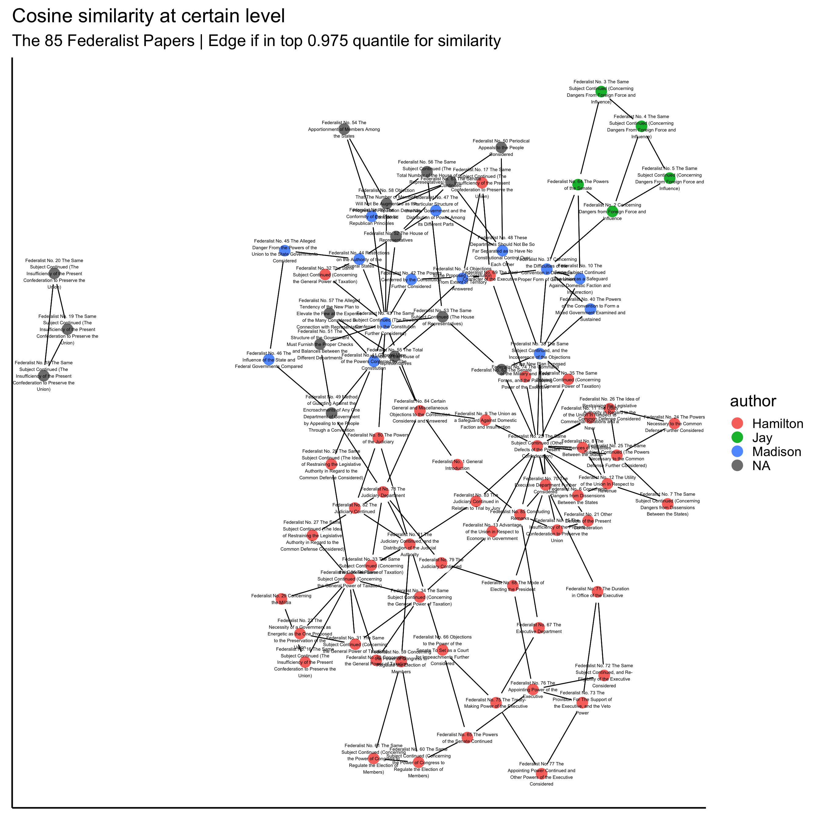
Now I do the same thing using the alternate preparation. When I used the above preprocessing method, basically the template that I’d used before, I felt disappointed. I expected there to be more “clustering” among the authors; but what seemed to really dominate was topics. It made sense, but I still felt let down.
Thankfully, I took a step back from fiddling with the graphing parameters to review all the code. I came back to the preprocessing code. Hmm. What was being done to alter the raw text? Lots! And there could be the idiosyncratic, tell-tale authorship “signatures” in what was being removed and standardized. So, I modified the preprocessing step to do less to the raw text; below I just comment out the options so the difference is clear. Instead of removing stopwords, we keep them. And we don’t do any stemming. We keep punctuation and numbers too. Then I prep the recalculated similarity scores into an adjacency matrix to allow for a revised network graph.
corpus <- corpus(federalist)

dfm <- dfm(corpus,
           # remove_numbers = T,
            # remove_punct = T,
             remove_separators = T #,
            # stem = T,
            # remove = stopwords("english")
           )

# Calculate cosine similarity
similarity <-
  textstat_simil(dfm,
                 method = "cosine",
                 upper = T, diag = T)
## Warning: Arguments upper, diag not used.Graphs when cosign similarity contains stop words
The adjacency matrix is prepped in the exact same way as before.
## Warning in summary_character(texts(object), n = n, tolower = tolower, ...):
## verbose argument is defunct
## Warning: Ignoring unknown parameters: colour
That’s more like it! I was hoping to observe more separation between authors, and with less preprocessing, that’s exactly what we see. Great!
Also in other analyses the disputed texts are in the Madison “zone”, and most scholars that have done textual studies believe the texts were indeed written by Madison, and a few maybe jointly by Madison and Hamilton.
Wrapping up
Worries
The unsatisfying thing about this exercise is that you don’t know which particular word choices and idiosyncratic features drive similarities. But that is the case when using a summary like cosign similarity. You would have to dig in further to look at influential components, I suppose.
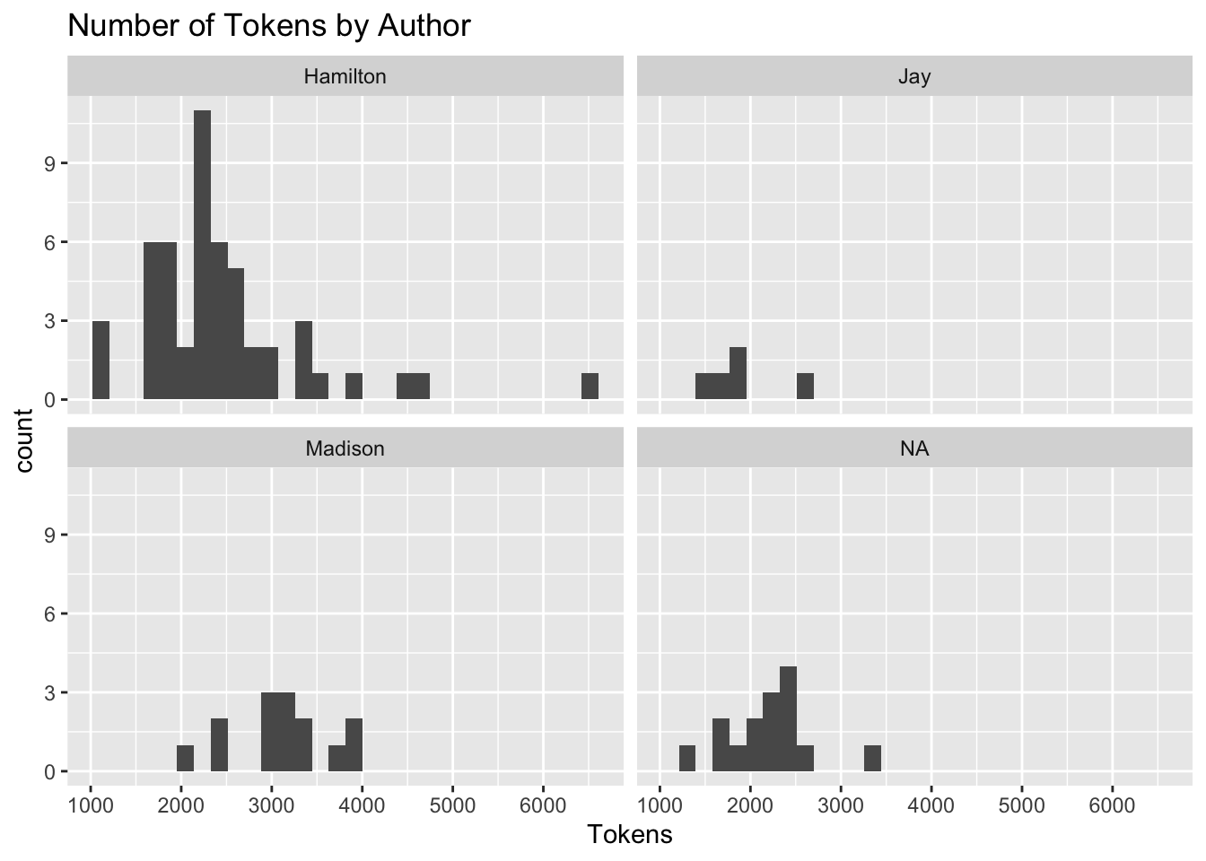
I’m always worried that length of documents drive statistic too. Maybe length of documents contributes to finding cosign similarities. Madison’s works on average are longer than Hamilton’s. Could this be driving things. Maybe.
## Joining, by = c("name", "title", "venue", "date", "author")## `stat_bin()` using `bins = 30`. Pick better value with `binwidth`.
The Alternative
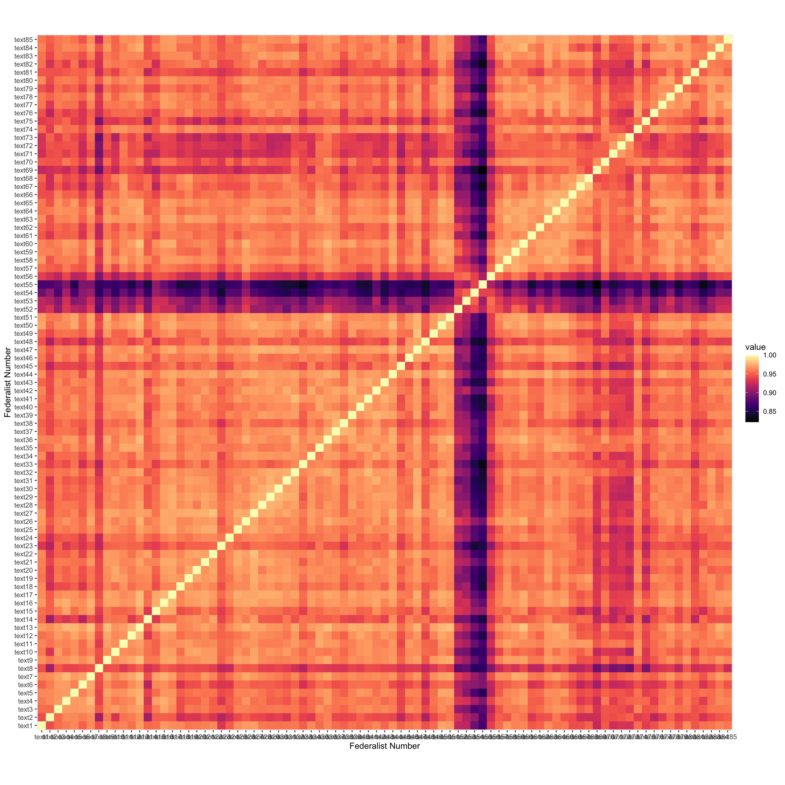
Perhaps a classic alternative visualization is to show all the cosign similarities with a heat map. Then we aren’t deleting so much information as I do with the network graph — in the network graph we only know if a document is among the top two most similar, or not.
I make it here, sorting by author, but I don’t really clean it up, maybe to put my technique in the best light, maybe because I’ve really spent too much time on this. But, I think there is something charming and likable about the network approach compared to the heat map. Something friendlier. And that’s where I’ll leave things for now.
## Warning: Arguments upper, diag not used.